Presentation matters
Be sure that everything in your portfolio is neatly presented. This means no white backgrounds, no dirty fingerprints, no random sketchbook drawings, no ripped edges, no half finished figures, etc.

It takes very little time (sometimes just a few minutes!) to clean up your presentation. The same drawing presented in a neat way vs. in a messy way can make or break the impression your artwork gives off.


Cropping makes a difference
Look at the difference between these two versions of this portrait drawing: one drawing shows the clips on the drawing, the easel, random stuff in the background, etc.
A crop in Photoshop which takes just a few seconds gets rid of all that clutter in the image so we can focus see the artwork very clearly.
Those few seconds matter!

Limit slides to 1-3 separate images


Frequently, students try to squeeze in multiple images onto a single slide, thinking that the more, the better.
Actually, multiple images on a single slide looks too busy and it’s tough to see each artwork clearly. The best way to approach your slides is to stick to 1 image per slide.
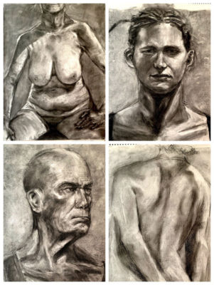
The slide on the left has 4 strong charcoal drawings, each of which really deserves its own slide so that the piece can be fully appreciate without the distraction of the other drawings.
The only instances where you may want to have 2 or 3 separate pieces on a single slide is if you have an artwork where the pieces go together, such as illustrations from a children’s book where the images have a clear relationship with each other.
Bring your artwork to a full completion

The quintessential problem in artwork by high school students is not bringing a piece to a full finish.
Many portfolio pieces by high school students are only about 50% finished, and have big problems like glaringly empty backgrounds and a lack of refinement and detail.
This drawing on the right has lovely details in the individual objects. However, the composition and the background of the drawing has not been considered.
Composition refers to the placement of each subject on the page, and is a fundamental element of creating an artwork. The background is totally blank, causing the drawing to look unfinished.

Sometimes the difference really is one extra hour working on the artwork to fill in those gaps.
Other concerns, like a lack of a background are more fundamental and need to be addressed much earlier in the process of the artwork.

Don’t worry about going “too far”
The majority of students get really worried that they will ruin their piece if they continue to develop the piece. The consequence is that many students stop working on their projects prematurely, which leads to works that are unresolved.

I pretty much have yet to see an artwork that is overworked in a student art school portfolio, the vast majority of pieces are under worked.
Err on the side of working your pieces beyond what you would normally do.
Usually students who think they are doing “too much,” to an artwork end up bringing their pieces to a good state of completion.


One exercise to try is to choose an artwork (preferably one that you are not very attached to) and to deliberately overwork it to the point that it’s super obvious that you did way too much to the piece.
You’ll never know how far to take an artwork until you’ve taken it too far.

Don’t be precious with your artwork
While it’s important to value the artworks you create, be careful that you don’t get too fixated on the product to the point that you are unwilling to try something new with an artwork.
This is one of the reasons why it’s so useful to maintain a really high production rate and to not spend 4 months on a single drawing.

If you are creating a drawing once a week, you won’t be so precious with your work, because you’ll be in the mindset that if the piece you’re working on doesn’t go well, you’ll just make another one.
If you take 4 months to finish a drawing, it feels like the end of the world if someone suggests you try something a little bit different.
You’ll end up walking on egg shells with your artwork, which will stifle your artistic growth and ability to experiment and try new approaches.


Composition & Backgrounds matter!
There’s a difference between composing a drawing vs. drawing randomly on a sheet of paper.
Composition is an aspect of creating artwork that is ignored and not considered by most high school students. Most students usually default to placing their subject in the dead center of the page, with a blank background.

This isn’t because they can’t compose, it’s usually because they haven’t stopped to take the time to consider the placement of their subject on the page.
Like any other concept in visual arts, composition takes time and patience to learn. The part of composition that is difficult to learn is that there are no rules or formula that you can follow to create a successful composition.


The most effective way to improve your skills and composition is to simply experiment as much as you possibly can with as broad of a range of compositions.
So much of the process of learning how to compose well as simply trial and error, and of course, every single artwork you create you have to evaluate on its own terms.
Watch our composition videos to get concrete tips on how to compose an artwork!


