This video explain the basics of how complementary colors work and how they can be used effectively to create color contrast in color art media.
- 1 min. short (Pthalo colors)
- 1 min. short (seeing pthalo colors)
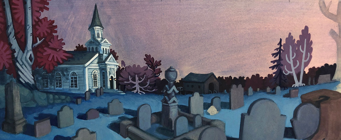
- 45 min. video (blue & orange)
This video focuses on blue and orange as an example. By looking at examples in contemporary art and art history, this video discusses the way the complementary colors are laid out in the color wheel, as well as how complementary colors can be implemented into paintings.
Discussion led by Art Prof Clara Lieu and Teaching Artists Alex Rowe and Lauryn Welch.

Video Walkthrough
- Reviewing the advantages of complementary colors.
- What is the relationship between grey and complementary colors?
- Complementary color chart exercise
- James Turrell’s exhibition at MassMOCA.
- James Turrell’s artwork is an experience that cannot be replicated in photographs.
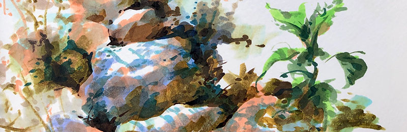
- Complementary colors in an artwork that doesn’t have recognizable images.
- Associations people have with color: the sky is “blue.”
- Colors can be associated with emotions, or with time of day.
- How complementary colors can become cliches when overused.
- Blue and orange are often seen in movie posters and cinema.
- Red and green is commonly associated with Christmas.
- Malcom Liepke is uses neutrals to support his saturated colors.
- Ralph McQuarrie is a concept artist who defined the field of concept art.
- Ralph McQuarrie uses colors to create the narrative and emotions.
- Brad Holland uses bold, graphic shapes, layering complementary colors over each other.
- Highly saturated colors in Hope Gangloff’s paintings are effective.
Artists mentioned

As a free educational source, Art Prof uses Amazon affiliate links (found in this page) to help pay the bills. This means, Art Prof earns from qualifying purchases.