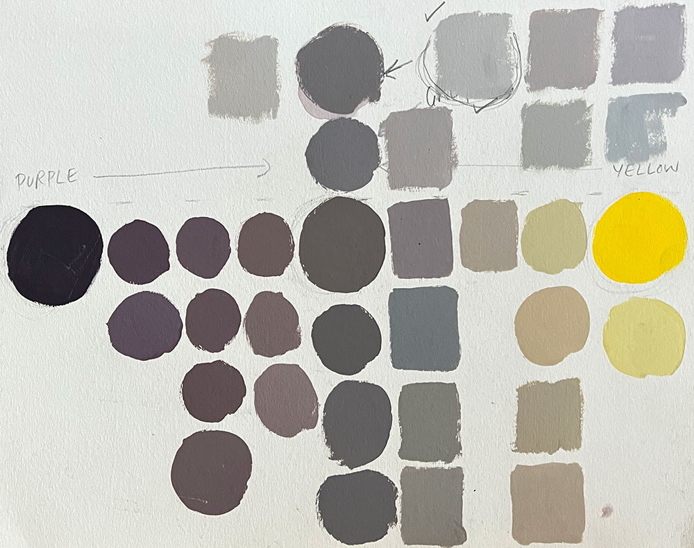
This video shows a color chart mixing exercise based on complementary color pairs, using purple and yellow. This color chart is very effective in terms of training your eye to see subtle shifts of color.
- Watch the 46 second short
- Watch the 78 min. version
This video shows how to develop a more sensitive color mixing technique, and mixing different levels of saturation with the opposite color instead of relying on straight white and black out of the tube.
Painting demo in gouache by Art Prof Clara Lieu.
Video Walkthrough
- Grey is in the middle of every complementary color.
- Complementary color still lifes
- Teaching color theory
- Draw 9 circles: center circle is grey, the first and last circle is the complementary color pair.
- Use complementary colors that are straight out of the tube so they are the most saturated they can be.
- Work from left to the center, then from the right to the center.
- With gouache you don’t need large blobs of paint, you can always add more rather than using too much
- Don’t use too much water, you want your color swatches to be opaque.
- Gouache can be rehydrated.
- Make sure you use a lot of white; if your color mixtures are too dark then it will be hard to see the color mixtures clearly.
- The intent of this exercise is to get you to see very subtle shifts of color in the grey tones.
- Mixing black and white paint to create grey tends to look boring.
- The aim is not to get the “right” mixture right away, you’ll make tons of adjustments, and that’s good!
- Don’t paint over swatches, paint the swatch below so you can save all of the mixtures that you mix.
- Color is about context, there is no “right” blue mixture.
- The way a color comes across has a a lot to do with the colors that are surrounding it.
- See colors as a group, don’t look at them in an isolated manner.
Prof Lieu’s Tips

For me, starting with out with obnoxious rainbow colors was incredibly important when I was learning how to approach color in portraits.
I had a painting professor tell me I had “an eye for grey” in my figure paintings. (Yikes! I was so upset when he told me that)
His crayon drawing technique was great because it made me confront those bolder colors, if I didn’t use the crayons I would just mix the colors to death until they got super muddy!
Gouache Colors
- Spectrum Red
- Primary Blue
- Primary Yellow
- Permanent White
We want to share your progress!
- Did you do this lesson?
- Submit to have your work to be posted here on this page or mentioned in a live stream.
As a free educational source, Art Prof uses Amazon affiliate links (found in this page) to help pay the bills. This means, Art Prof earns from qualifying purchases.