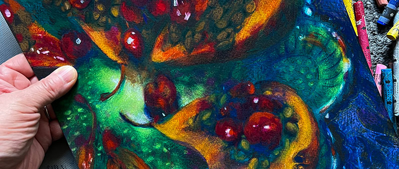
This video explains how warm colors and cool colors can be used to create mood and contrast in an artwork.
- 1 min. short (pthalo colors explained)
- 1 min. short (pthalo colors in contemporary art)
- 45 min. video (warm & cool)
- 43 min. video (worst color mistakes)
While there are colors that are stereotypically seen as “warm” and “cool,” warm and cool colors are contextual, and is often times not as straightforward as it might seem!

Examples from contemporary art and art history are show to illustrate the many nuances of color temperature. Discussion led by Art Prof Clara Lieu and Teaching Artists Alex Rowe and Lauryn Welch.

Video Walkthrough
- Yellow, orange and red are the “stereotypical” warm colors.
- Blue, green, and purple are the “stereotypical” cool colors.
- Blue isn’t always cool!
- Consider what subjects you associate with physical temperature.
- What is the difference between a warm grey, and a cool grey?
- Comparing 2 different reds: Alizarin Crimson and Cadmium red, which is cool, and which is warm?
- Don’t look at a color in isolation, see colors as a group.
- Evaluate each color in relation to the colors that are next to it.
- Saturation can determine whether a color feels warm or cool.
- Consider different types of environments and the types of colors you associate them with.
- People perceive color temperature in many different ways.
- If you’re a beginner painter, starting with fewer colors is easier, you can incrementally add colors as you go.
- There are infinite shifts of white, white is never really straight white.
Prof Lieu’s Tips

I remember after I felt like I finally had somewhat of a decent grasp on color that it completely transformed how I looked at artworks.
I used to think that all the color theory wasn’t really important, that the color decisions were random and that analyzing the colors was just people reading too much into the painting.

I went to a museum after gaining knowledge in color theory and my reaction was omg… color theory IS a thing, and it makes so much sense if you take the time to look for it.
Colors mentioned
- Venetian Red
- Sap Green
- Alizarin Crimson
- Cerulean Blue
- Cadmium Red
- Burnt Umber
- Burnt Sienna
- Naples Yellow
- Prussian Blue

As a free educational source, Art Prof uses Amazon affiliate links (found in this page) to help pay the bills. This means, Art Prof earns from qualifying purchases.


