Table of Contents

Show you are open many subjects
Depicting a wide range of subject matter throughout your entire art school portfolio demonstrates your willingness and interest to work in many contrasting ways.
There is an endless range of possibilities when it comes to subject matter in a portfolio.

Admissions officers don’t want to see an art school portfolio of twenty self-portraits.
When a portfolio has too much of the same subject matter, the message you are sending an admissions committee is that you don’t want to try anything new, and that even at this early age, you’ve are already set in your ways.
Attending art school is all about exposing yourself to as many new experiences as possible. Having an art school portfolio with only one topic comes across as narrow minded and limited.

Anything is possible with subjects

The most obvious subjects for your art school portfolio artworks are traditional ones such as figures, portraits, self-portraits, still lifes, landscapes, interior spaces, forms from nature, architecture, and others.
These are all excellent subjects to address in your portfolio and a good place to start if you’re not sure what to do.
Don’t stop there though, there are so many other subjects you could address such as character design, abstraction, creature design, industrial design, historical events, editorial illustration, typography, cooking, urban sketching, imaginary landscapes, political art, current events, poster design, book covers, etc.

Essentially, anything under the sun is a viable option when it comes to subject matter. Be open and willing to try many different subjects, you’ll gain the variety you need for your art school portfolio and develop new skills in new imagery.
If you are at a total loss for what to do, look at our giant list of art prompts.
Don’t rely on class assignments
At the same time, you don’t want every piece in your art school portfolio to appear to be simply a technical exercise that you were given in art class at school.
An art school portfolio of still life drawings that are obviously class assignments tend to have a generic quality and usually don’t show off your ability to communicate a personal idea, a unique opinion, etc. in a visual manner.
That’s not always the fault of the student, sometimes it’s the fault of an assignment being too rigid and specific to the point that there is simply no opportunity to make the project your own, no matter how hard you try.

For example, if the still life of a cardboard box that your art teacher set up for you to draw in class in pencil was boring for you, chances are, your drawing of that still life is probably pretty boring to look at.
So many people think about still life as an inherently boring subject, when really, it’s usually that way because students weren’t given any opportunity to participate in selecting the objects and setting it up.
Hate your art teacher’s stupid still life? Take matters into your own hands and pick your own objects and set up your own still life that you are actually enthusiastic about to paint.

Don’t assume a subject is boring
If Claude Monet was able to get exciting about painting haystacks repeatedly, then anything must be possible. (can you imagine a subject matter more mundane, more boring than a haystack?)
Antoine Vollon painted a mound of butter and made it monumental and fascinating as a painting subject.

For most art students, there’s an immediate assumption that if they are told they will be painting a still life, the still life will definitely be boring. Still life is only boring if you let it be boring.
Prof Lieu told her college students during drawing class that if they are bored, it’s THEIR fault!

Find stimulating art prompts

Or, sometimes an assignment from an art class has such a specific, rigid format that it’s glaringly obvious that a student was told exactly what to do.
With an art assignment like this, you could could practically write the lesson plan just from glancing at the project for 10 seconds.
In the image on the right, it’s very obvious that the assignment was for the student to take one subject (in this case, a dinosaur) and to draw variations of that subject using different art media and art styles, some of which are based on art historical movements within the context of a 3 x 4 grid.
Regardless of who creates an artwork in response to this assignment, the results are all really similar. The requirements are so specific that there’s no space for a high school art student’s individual voice to come through in the artwork.

This is why you simply cannot rely on your art class assignments to fill in your entire portfolio.
At a certain point, you’ll need to take the initiative to design your own projects, find ones that you find stimulating, and step away from those uptight assignments that leave very little room for creativity.


Develop brainstorming skills
Art schools are looking for students who can think about their artwork, who can develop and brainstorm ideas that they can communicate through their artwork.
There is no art class in high school that can accomplish all of that for you. Try our Brainstorming Track which is a series of lessons and prompts to provide the skills you’ll need.

Artworks in your intended major is optional
Students are frequently concerned about showing their interest in a specific major in their portfolios.
For example, a student who has a genuine interest in majoring in jewelry & metalsmithing will not be expected to apply with a portfolio full of metal pieces.

Many students worry that their lack of pieces in their intended major will work against them in the admissions process, when in fact, it doesn’t at all.
You could have every intention of majoring in jewelry & metalsmithing, not have a piece of metalwork, and still be a really strong candidate for a school.
Don’t limit yourself
On the other hand, there are plenty of students who do get experience in their intended major before they apply to art school.
Let’s say you attended a rigorous summer pre-college program where specific majors were offered, and you were able to produce a number of graphic design pieces: a series of 5 poster designs, 3 business cards, 4 postcards, and 3 book jacket designs.


Most people would make the assumption that for someone who is intending on majoring in Graphic Design, that including as many of these graphic design pieces in your portfolio as possible would garner the best results.
This actually isn’t the case at all, in fact, your portfolio should not be 20 graphic design pieces.

You can certainly include perhaps 2-3 graphic design pieces in a portfolio of 20 pieces if you have them. However, the more critical aspect of your portfolio is that you have a wide, well rounded skill set.
“Architecture” isn’t what you think it is

Another word of caution: unless you attended a competitive summer pre-college program at an art school, or your parents are professional architects, there’s a fairly decent chance that what you think is architecture, actually isn’t.
It’s really common for students to make assumptions about what is involved in a specific major, only to find out later that the major is actually nothing like what they imagined.
A student once told Prof Lieu at a summer pre-college program that they chose architecture as their major for the program because their dad told them that architecture was for “people who were good at math.”


Since this student excelled in math, based on his dad’s advice, they chose architecture as their major. However, it quickly became obvious that there is much more to architecture than math.
Architecture became this student’s most disliked course during that summer program, and it was glaringly clear to this student that they were definitely not going to be majoring in architecture in the future.
“Illustration” isn’t only picture books
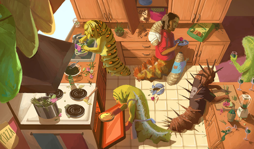
Prof Lieu taught in the Illustration department at RISD, and it’s really common for her to encounter students who go into illustration really without an accurate idea of what the field of illustration is all about.
Ask one student what illustration is, they might reply “it’s drawing covers for books!” while another might say “it’s making images for ads.”
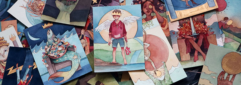
Actually the field of illustration is both, and so much more, including: editorial illustration, children’s book illustration, political cartoons, comics, character design, concept art, storyboarding, and more.
Don’t make assumptions about what any given field of visual arts will be like. On top of that, every art school will have it’s own interpretation of the field.

You could look at illustration departments at two art schools, and they could be vastly different from each other.
Perhaps one takes a very commercial approach and prepares students for a specific industry, whereas another may have a more loose approach and interpretation to what illustration is.


