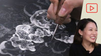
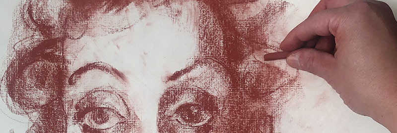
Art Prof Clara Lieu demonstrates how to do drawings of a heads using Conté Crayon.
- Watch the 3 min. version
- Watch the 5 min. version
- Watch the 2 hour version
Prof Lieu explains how sketch the essential bony structures of the skull, and then how to knock in big patches of tone to give the head mass and weight.


Video Walkthrough
- People tend to focus on the pupils, but actually it’s the form of the eyeball and the eye lids that matter more.
- Look for the creases on the sides of the mouth, they will make the mouth “sink” into the face better.
- Hair is messy! Don’t be afraid to let that part of your drawing be messy.
- Drawing teeth can be challenging, they often look awkward.
- The key to drawing teeth is to not outline every single tooth, that makes them too prominent.
- The reference photos of people you find on Pinterest are very homogenous and don’t represent the true diversity of the population.
- The ears are just cartilage, they don’t have the structure that the skull has.
- The experience of making drawings of all different sizes can help a lot in making you more versatile as an artist.
- Drawing bigger is not necessarily harder or more work, in fact it can provide flexibility that sometimes a smaller drawing can not.
- People often leave out the glasses in portraits, but glasses can be such an important part of someone’s identity.
- In terms of proportions, the width of the mouth is always bigger than the width of the nose.
- Be willing to make lots of tweaks and changes in your drawings.
- Be sure to block in the mass of the hair early on, don’t leave it for the last moments of the drawing.
Reference Photos
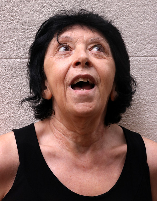
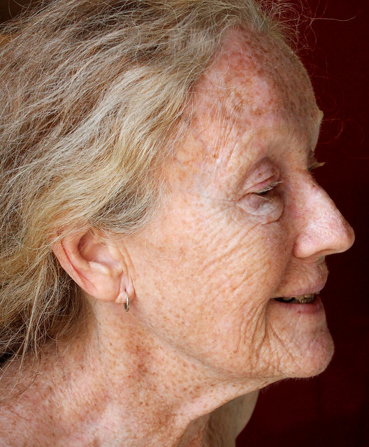

Prof Lieu’s Tips

In terms of capturing the gesture of a tilted head, it’s common for us as the artist to unconsciously straighten out that tilt. I find that in general with figure drawing there is a tendency for people to understate angles in a pose.
A lot of people approach drawing the figure in terms of trying to be accurate and faithful to the pose. However, with that approach often the figures end up not as dramatic as the reference photo.
What I tell people is to intentionally exaggerate the angles and tilts in a figure’s pose, to the point where it feels like it’s way too much. Quite often when people do what they think is exaggeration, that actually ends up just about right!
Reference Photos

Artworks mentioned
- Nan Goldin, Roommate with teacup, Boston, 1973
- Nan Goldin, Colette in Sophie Loren Drag, 1973
- Nan Goldin, Bea as Blonde Venus, 1974
- Diane Arbus, Couples
- Diane Arbus, A Young Man in Curlers at Home on West 20th Street, N.Y.C., 1966
- Diane Arbus, Woman in a rose hat, N.Y.C., 1966
We want to share your progress!
- Did you do this lesson?
- Submit to have your work to be posted here on this page or mentioned in a live stream.
As a free educational source, Art Prof uses Amazon affiliate links (found in this page) to help pay the bills. This means, Art Prof earns from qualifying purchases.