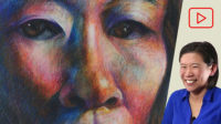
See a step by step drawing demo on how you can create unusual color mixtures to make a portrait drawing with markers and Photoshop.
- 1 min. short (water based vs. alcohol based markers)
- 85 min. video (Ohuhu and Posca Markers)
- 80 min video (Tombow Markers)
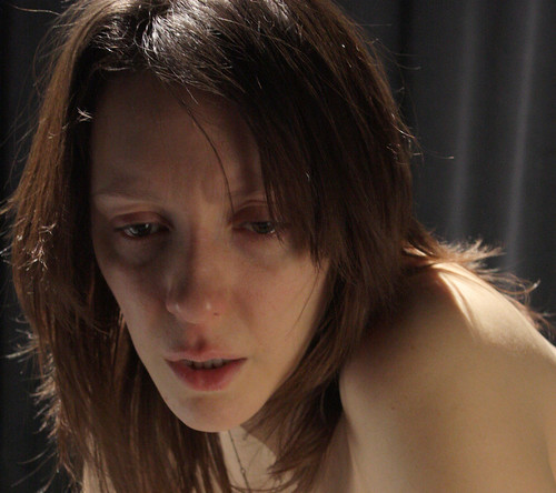
Explained are ways to tweak reference photos to get ideas for colors, and how to translate that into a drawing with a dynamic range of colors.
Demo by Art Prof Clara Lieu and Teaching Artist Jordan McCracken-Foster.


Video Walkthrough
- Messing around with the raw reference photo in Photoshop, or on your phone is a great way to quickly try out lots of dramatic color palettes.
- Play with the color saturation, brightness and contrast, color balance, and hue.
- If you can get your reference photo as close as to your artwork, do it!
- If you are doing a black and white charcoal drawing, but your reference photo is in color, it’s worth changing your reference photo to be black and white.
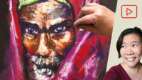
- Color in a portrait can be a very powerful visual tool.
- The default approach to color in a portrait is usually to match the exact skin tones, but that doesn’t always have to be the case!
- Try mixing colors that aren’t so close to each other. For example, adding yellow to orange isn’t a very adventurous use of color because these colors are very close to each other.
- Prof Lieu didn’t use a black marker, instead she added very dark greens into the red face to create more variety in the darks.
- Using an unrealistic color palette for your portrait is a way to push your portrait in a different direction, and also frees you up so you aren’t stressing about accurate colors.
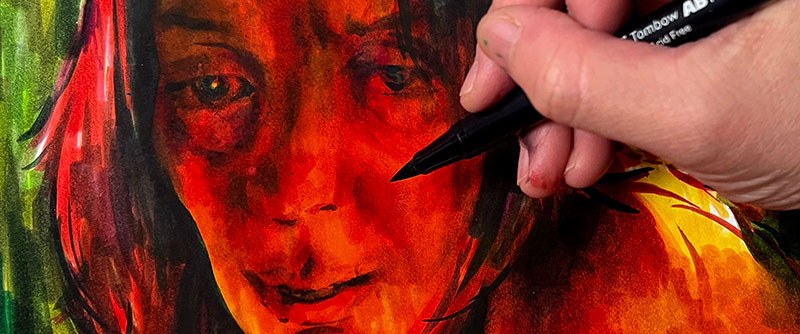
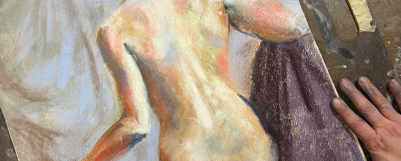
- Color contrast is really important, but don’t forget about achieving a range of values.
- Value is often times not addressed as much in a color portrait, as it’s easy to get really involved in the colors and forget about getting a range of value.
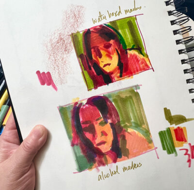
- Quick color thumbnails can be a good way to test out of you like where the color scheme is going.
- Even trying different media in your thumbnails is helpful.
- Prof Lieu did a thumbnail with alcohol based markers, and another with water based markers.

Prof Lieu’s Tips

I have a “2 week” rule, as in when I make an artwork, I put it somewhere where I can’t see it, and then when I come back it’s much easier to see with a fresh pair of eyes.
Otherwise, I will “babysit” the artwork and look at it waaaaaay too much.
I think most of us want to see visible progress, but when you think about it, significant progress really cannot happen within 1 week.
Which is why it’s nice to revisit old artworks from several years ago, and you realize that actually, you did improve!
Software
As a free educational source, Art Prof uses Amazon affiliate links (found in this page) to help pay the bills. This means, Art Prof earns from qualifying purchases.