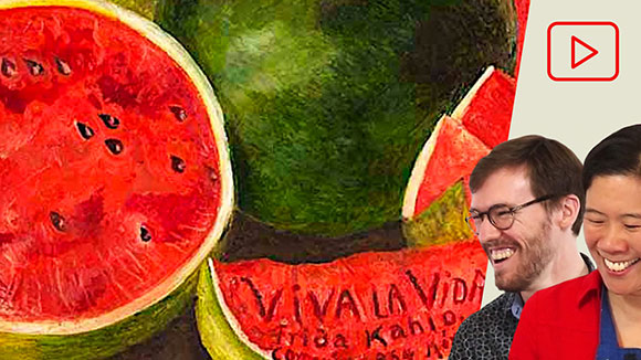
This video explains how warm colors and cool colors can be used to create mood and contrast in an artwork. While there are colors that are stereotypically seen as “warm” and “cool,” warm and cool colors are contextual, and is often times not as straightforward as it might seem! Examples from contemporary art and art […]
Tag: color fundamentals
- 3D
- Abstraction
- Acrylic
- Adobe Fresco
- Anatomy
- Animals
- Animation
- Architecture
- Art Club
- Art Dares
- Art School
- Art Supplies
- Art Videos & Podcasts
- Artist Portfolios
- Artist Wellness
- Artistic Process
- Artists
- BFA Portfolio Critiques
- BFA Programs
- Books
- Brainstorming
- Business & Selling
- Careers
- Character Design
- Charcoal
- Clothing
- Collage
- Color
- Colored Pencil
- Comics
- Composition
- Conté crayon
- Contemporary Art & Art History
- Copyright
- Crayon
- Critiques
- Critiques - How to
- Curriculums
- Design
- Digital
- Drawing
- Elements of Art
- Exhibiting Your Art
- Figure
- Food
- Free Tracks
- Fundamentals
- Gouache
- Illustration
- Image References
- Landscape
- Learn & Create
- Lesson Plans & Prompts
- Lighting
- Marker
- MFA Portfolio Critiques
- MFA Programs
- Oil
- Oil Pastel
- Painting
- Pen & Ink
- Pencil
- Perspective
- Photo & Video
- Photoshop
- Plein Air
- Portrait
- Printmaking
- Private
- Pro Development
- Procreate
- Promotion
- Publications
- Resources
- Schools & Opportunities
- Sketchbooks
- Soft Pastel
- Still Life
- Student Galleries
- Tables of Content
- Thumbnails
- Tools for Teachers
- Tutorials by Media
- Tutorials by Topic
- Water Mixable Oils
- Watercolor & Egg Tempera
- Workshops
This video explores color saturation, explaining how intense and muted colors can work together effectively in fine art, illustration, film, character design, and more. Both muted and intense colors contribute important elements of color that are both equally important in an artwork. Discussion led by Art Prof Clara Lieu and Teaching Artist Jordan McCracken-Foster. Video […]
Planning a color scheme for an artwork is an effective way to achieve visual cohesion and intent in your artwork. Color schemes are an effective way of establishing a mood in a painting, as well as creating visual contrast and textures. There are many ways to collect ideas for color schemes and apply them to […]
This video shows a color chart mixing exercise based on complementary color pairs, using purple and yellow. This color chart is very effective in terms of training your eye to see subtle shifts of color. This video shows how to develop a more sensitive color mixing technique, and mixing different levels of saturation with the […]
This video explains the basics of how complementary colors work, focusing on purple & yellow. An explanation for how complementary colors are laid out in the color wheel is provided, as well as how complementary colors can be implemented into paintings. Discussion led by Art Prof Clara Lieu and Teaching Artists Deepti Menon and Lauryn […]
This video explain the basics of how complementary colors work and how they can be used effectively to create color contrast in color art media. This video focuses on blue and orange as an example. By looking at examples in contemporary art and art history, this video discusses the way the complementary colors are laid […]
Complementary colors are a fundamental part of color theory that can vastly influence how you use color. We define what complementary colors are, and how they can be used effectively to create color contrast in color art media. Explained is the way the complementary colors are laid out in the color wheel, as well as […]


