Table of Contents
Art Prof Clara Lieu and Teaching Artists Lauryn Welch and Jordan McCracken-Foster discuss mistakes you can avoid when preparing an art portfolio for art school.
- Watch the 1 min version
- Watch the 1 min version (the mistake everyone makes)
- Watch the 4 min. version
- Watch the 46 min. version

Types of artwork such as fan art, anime, celebrity portraits are generally not what admissions officers at art school art looking for, in addition to cliche images, centered compositions, and blank backgrounds.
Prof Lieu, Lauryn, and Jordan explain the reasons why and what to avoid.

Video Walkthrough
- Celebrity portraits are often distracting in a portfolio, people have all kinds of assumptions about celebrities that keep them from appreciating the artwork.
- Fan art & anime really will not be accepted in an art school portfolio; there is nothing wrong with making art like this in other contexts, but not in this one.
- Poor photos of the artwork can make an excellent artwork look terrible! Take the time to shoot good quality photos.
- Avoid copying a reference photo verbatim, where you are not changing or manipulating any aspect in your drawing.
- Confusing slide formats that have too many images that make it hard to focus on the artworks.
- Centered compositions are the default way people approach composition.
- Creating compositions that are not dead center will make your portfolio distinguish itself from other portfolios.
- Empty backgrounds are extremely common, most people don’t take the time to invest in learning how to draw landscapes and backgrounds.
- Feedback from family & friends won’t help you!
- Your family and friends mean well, but they are not equipped with the skills to help critique your art.
- “Cookie cutter” art class projects are seen everywhere, remove these from your portfolio as your voice doesn’t tend to be as present.
- Cliché images are common, inform yourself of what those cliches are!

These mistakes are very common
There are a number of “quintessential” mistakes that I see over and over again when evaluating art school portfolios for college admission.
If you watch several of our art school portfolio critiques, you’ll notice that regardless of which of our staff artists is critiquing the portfolio, there are several classic mistakes that are extremely common among high school art students.


In visual arts, sometimes what you deliberately choose not to do can be more important than what you choose to do. A lot of this is about building an awareness of what to consider in advance of starting the final artwork.
How will you distinguish yourself?

Remember, admissions officers have looked at literally thousands and thousands of art portfolios, so most of these mistakes that I have listed for you below are nothing they haven’t seen before.
I’ve reviewed enough art portfolios in my life that I can spot these mistakes from a mile away, these mistakes start to stick out like a sore thumb to an experienced art professional.
Figure out what the cliché is
If you want to do a self-portrait drawing for your art school portfolio, do a Google Image search for “high school self-portrait drawing” and see what pops up.
I’m guessing you’re going to see rows of self-portraits that are 1) front views of the face, 2) the face placed in the middle of the page, 3) drawn in pencil, 4) with a blank background.
This self-portrait drawing in pencil above (that Art Prof Teaching Artist Jordan McCracken-Foster did in high school!) could use some better contrast and a more engaging background, but, note that he did not place the figure right in the center of the page.

That one shift from the cliché high school self-portrait drawing makes a difference.
Now you know what not to do!
Steer clear of photo-realistic artworks that are copied straight from a photo.
Note that I said “copying” a photograph, as opposed to “drawing” from a photograph. There’s a gigantic difference between the two! I define “copying” a photograph as a process where an artist finds a photo online and essentially produces a version of the image as a photo realistic pencil drawing.

High school art class is often times a competition for who can draw the most photo realistically.
Students are given the impression that the closer their pencil drawing looks to a photo, the more skilled and more successful they must be as an artist.
In my opinion, if your ultimate goal is to make your drawing look just like a photograph, why not just save your time and take a photo?
Drawing is not about accuracy!
In fact, there are a lot of drawings that are accurate physical descriptions of a person, but that don’t remotely come close to expressing that person’s personality.
You can also have a portrait drawing that has inaccuracies but that truly captures a person’s character.
We have a page which talks about how you can tell an artwork is drawn from a photo, explains the difference between copying and drawing from a photo, and provides visual examples to illustrate how to effectively drawing from a photograph.


Not cool: Anime, fan art, celeb drawings, mastercopies
There’s absolutely nothing wrong with making artwork that is anime, manga, fan art, celebrities. (especially if it’s a drawing of Benedict Cumberbatch or Michael Fassbender, now THAT I can support!)
However, the fact is that the majority of art schools generally do not want to see artworks in these categories.

Mastercopies are really excellent for practicing your basic skills in drawing and painting.
I did a mastercopy of John Singer Sargent‘s Lady Agnew of Locknaw when I was a senior in art school and it was a pivotal experience in my study of oil painting.

I had to break down and analyze all of the brushwork, figure out the colors, it was such a good experience.
I learned a lot, but it was purely an exercise, and I didn’t do anything creative in terms of creating my own original image and composition.

I did my own fair share of fan art in high school! (if I had a dollar for every drawing I did of Robert Smith from The Cure, I would be a very rich lady)
Lots of my students tell me they find fan art relaxing and fun, and that it can be good practice for just getting those art muscles moving. That’s fine to do on your own time!
These types of artworks can have their place in your own artistic practice, but they don’t belong in your art school portfolio.

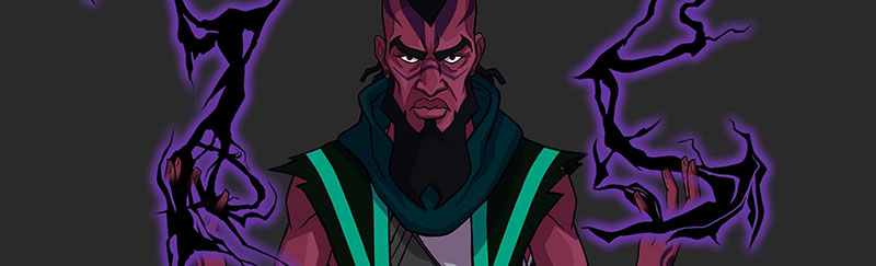
This artwork above would be considered to be celebrity artwork, since the imagery is based on Blindspotting. (2018 film)
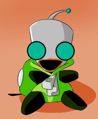
This digital painting is fan art of GIR from Invader ZIM. (TV Series 2001-2004)

This artwork would be considered to be fan art, since the drawing depicts Lyanna Mormont, a character from Game of Thrones. (2011-2019 TV series)
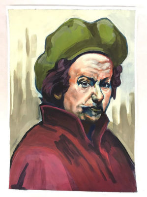
This painting is a mastercopy of a self-portrait by Rembrandt.
Poor photos are a dealbreaker
A poorly shot photograph can completely misrepresent your artwork, this is especially true when it comes to photographing 3D artwork which is very challenging to do well.

I’ve seen plenty of situations where the student had a wonderful 3D artwork, but the photograph itself had so many problems that the 3D artwork no longer seemed like a strong piece anymore.
There are a whole host of factors to take under consideration, your backdrop, the lighting, colors, adjustments in Photoshop, and more!

In this photo above of this mixed media 3D artwork, the point of view from which the photo is shot makes the 3D artwork appear to be very flat.
The lighting on the artwork is too stark and harsh, therefore the black curtains on the sides of the artwork sink into the background and are tough to see.
It’s also unclear whether this slide is two photos of the same 3D artwork on the same slide, or if it’s one photo of one 3D artwork.

In this photo of white 3D structures, the white backdrop makes the contrast of the photo very low, making it difficult to see the shapes of the sculptures clearly.
Get specific & avoid generic images
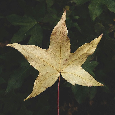
If you are creating a drawing that has an image of a leaf, instead of drawing the stereotypical version of a leaf out of your head, go online and look up leaves.
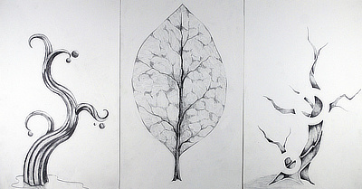
Especially with nature, there is a tremendous range of forms and shapes to choose from! I’m not sure why, but the images that seem to be the biggest offenders are images that include mountains, trees, and leaves.
Without a specific reference image to observe, we all end up drawing that one generic version of a tree, and it’s incredibly boring.
Think about leaves from a gingko tree, a maple tree, a tulip tree, all of those leaves will be infinitely more engaging than that stereotypical leaf in the student drawing on the right.


Avoid blank backgrounds
Frequently, students get so focused on drawing the main subject of their artworks that they completely forget to address the background, or, they think that the background isn’t necessary or important to the artwork.
Having a blank background is distracting because the artwork can look unfinished, especially if the main subject has been worked on extensively and shows a lot of detail.

A background makes your art better
More importantly though, a blank background is a missed opportunity. A background creates an environment, a context , a place for your subject to exist within.
What if this drawing with a pair of hands had an outer space background with stars and planets, how would that tell a different story than if the background was a candy store?

Very often people rely entirely on characters to tell the story. However a background can tell as much of a story as a character can. Use the background to help you establish a mood, a story, a specific time period, an imaginary place.
Is it a night-time scene? Is it a day time scene? Is it take place on land or sea?
It’s really not enough just to color in the background. This approach will flatten the space, and the background just ends up looking like a fake backdrop on a stage set.
Take the initiative to really contextualize the scene, and try to create a sense of depth and atmosphere.
Confusing photos of your art

The slide for this 3D sculpture of a bird is confusing because the two images are photographed so differently to the point where it’s easy to question whether these are two images of the same piece, or two images or two separate pieces. (this is indeed 1 sculpture)
This is happening because the color of the backdrop changes with each photo. The backdrop is very dark in the larger photo, and very light in the smaller photo, which causes confusion about the color of the sculpture.
In terms of format, the choice to place a second photo of the sculpture in a circle shape is an awkward choice. The circular photos is so small that you can’t see the sculpture very well.
Avoid redundant photos

Especially for 3D artworks, frequently it’s useful to include another view or a close up view to show the artwork in much greater detail.
Sometimes there are details in the textural surface of an artwork, or a level of detail which will not be discernible in a view that shows the entire artwork.
However, a close up photo really has to reveal new visual information about the artwork that is not visible at all in the photo of the entire artwork.
In the close up photo on the right, the apparel piece is only slightly larger than the photo of the entire artwork.
We don’t learn anything new about this apparel piece when we look at the close up photo, so it feels unnecessary. Both photos are front views, so there is no change in terms of our point of view on the apparel piece.
Centered Compositions

Composition is a fundamental part of the art making process, and yet it is frequently not addressed in many art classes. Composition is essentially where you decide to place your subject on the page.
If you are painting a portrait, will you place the face in the upper right hand corner? Will you place the face at the bottom middle?
The problems is that many students in high school don’t take the time to think about composition. More often than not, students dive into the final artwork. The default response in terms of placement is to place the subject in the center.
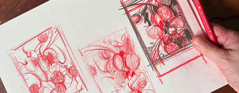
Thumbnails are critical

A sure fire way to make sure that composition gets considered is to create thumbnail sketches in advance of starting the final piece.
The general purpose of a thumbnail sketch is to plan out different options for composition before you get into creating the final piece.
At the thumbnail sketch stage, you can experiment with all different types of compositions and tweak them prior to launching into the final artwork.

This is not to say a centered compositions is inherently bad to have; there are plenty of centered compositions that are effective.
The difference is that most of the time, a centered composition is not a deliberative artistic choice that that the artist is definitely making in advance.
We can help you!
- You can hang out in our Discord server (it’s free) to ask questions and get advice in our #bfa-mfa channel.
- We have a range of art school services to support you, provided by our staff of professional artists.

I often times see T-shirts, sneakers, jackets, jeans, etc. that a student has painted on. Although I’m sure there many ways this could be done well, I can’t remember ever seeing an artwork in this format that I thought really fit the caliber of quality that an art school portfolio needs to have.
A better approach would be to construct your own apparel or wearable sculpture piece so that you are 100% responsible for the fabrication of the piece.
You have to think about the structure of the apparel piece yourself, the choice of fabrics, all of those factors are creative decisions that are not present when painting on a pre-made piece of clothing.
Look, even Prof Lieu did her fair share of fan art painted on a T-shirt in high school! (again, Robert Smith from The Cure)

Avoid unfinished artworks
Every artist on the planet has their own definition of what they consider to be a “finished” artwork. However, there are certain circumstances where it is fairly apparent that an artwork was left unresolved.
Usually the way to spot an unresolved artwork is if there are sections of the drawing that are visibly more developed and detailed, and other areas that have barely gone beyond the first bit of sketching.
In this portrait drawing below, the face is beautifully rendered. The shadows are soft and the highlights have a lovely, almost silky surface to them.
The areas around the face, like the hair, ear, neck, and clothing only have minimal preliminary lines sketched in.
In a situation like this, the expectation is that a finished version of this drawing would have the entire drawing developed to the stage that the face has been brought to.


Don’t pack a slide with many images
In the case of an art school portfolio, more images on a single slide is not always better.
When there are multiple images on a single slide, you can end up packing a slide so densely with so many images that the slide becomes visually crowded and difficult to navigate.

Another thing I’ve seen is students including the text information for the artwork (the title, media, size, project description) in the slide.
Schools usually have an area in their online application where you’ll be able to add that information into the application. There’s no reason to clutter your slides with this text information!

If you want to have more than one artwork on one slide, make sure you have a good reason why.
For example, if you have a series of artworks that are all aligned thematically and also in terms of art media, it would make sense to place two of those artworks on one slide.
Occasionally three images can work too, but in general I don’t recommend more than three images in one slide.
In this first slide with nine images, each image by itself on a single slide would be really striking to see. The compositions are very dramatic with highly saturated colors and are well designed.
However, when there are nine of these compositions in a single slide, the nine images really compete for our attention to the point where we practically tune out because of how overwhelming all of the images are together.

All of the colors, words, and shapes start to blend together and our eyes cannot discern one composition from another. In this way, the formatting of having nine images on a single slide does a disservice to the individual artworks.
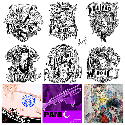
In this slide to the right, the six images at the top, which feature pen drawing portraits of authors, are clearly related to each other.
The three images at the bottom row appear to have no relationship whatsoever to the six pen drawings.
Clustering these nine images together becomes problematic because it feels like a patchwork quilt of random images.
Even if you remove the three images at the bottom, that might not be enough. Given that the six pen drawings at the top are so intricate and detailed, it would be beneficial to separate the six images so that they become two slides with three images each.
A more simple, sparse format like that for each slide would allow the viewer to really be able to appreciate the finer details of each pen drawing.


