Prompt
Choose 1 complementary color pair, and create a painting that only uses that complementary color pair.

Subject Matter
The subject matter is up to you! We do recommend, if you can, to paint from life. When you can observe in real life, you’ll see colors and subtle shifts of saturation, contrast, etc. that a photograph simply cannot capture.

If you can’t paint from life, we recommend shooting your own reference photos so you can control the image, lighting, and color.

Examples
Seraphim, @croooolik, Neil Espinosa


Purple & Yellow Still life prompt
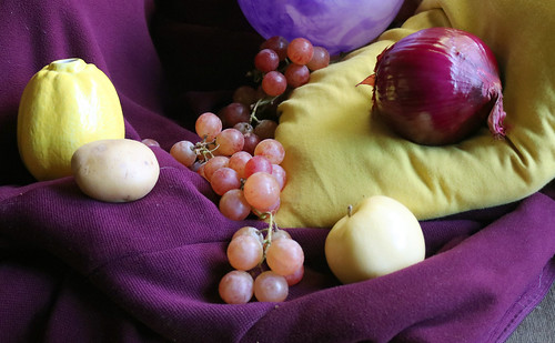
If you’re not sure what subject to do, an option is our purple & yellow still life prompt. Ideally it’s better for you to set up your own still life and paint from life, this video has tips for how to arrange and light a still life.
If you’re not able to set up your own still life, we have these purple & yellow still life reference photos you can use.
Tips
- This prompt draws greatly from your experience mixing colors for the complementary color chart in Lesson 1.
- The greys you mixed from the complementary color chart are now in your “library” of mixtures, use them!

- Lighting is hugely influential on how we perceive color, consider the differences between natural light (which is cool) and artificial light (which is usually warm, but there are exceptions) if it’s relevant.
- This video explains in detail the various scenarios for natural and artificial light and how to approach them.
- Consider painting with your palette knife, this technique can be very helpful in terms of building a solid foundation of opaque paint.

Thumbnail Sketches
We recommend doing about 6 small thumbnail sketches to explore a diverse range of options for your composition. Start your first thumbnail sketches with line and think about how you want to place your subject onto the page.

After you choose the thumbnail you want to use for your painting, it’s really helpful to used a color drawing media (colored pencil, marker, crayons) and quickly block in color to get a feel for how the colors will interact in the composition.

Related slideshows
- Thumbnail Sketches
- Color Saturation
- Natural & Artificial Light
- Red & Green
- Blue & Orange
- Yellow & Purple
Art Media
Any paint medium, you can reference our supply lists for items we recommend: watercolor, gouache, acryl gouache, acrylic, oils, water mixable oils, liquid watercolor, alcohol inks
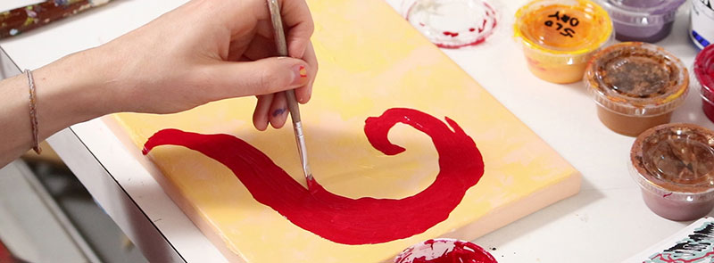
Purple & Yellow Still Life Painting
Art Prof Clara Lieu demonstrates water mixable oil painting techniques of a still life based on the complementary pair yellow and purple.
This is a follow up exercise to a complementary color chart that Prof Lieu did in gouache to explore complementary colors. Prof Lieu talks about color saturation, value, composition, and more.
Color Saturation
This video explores color saturation, explaining how intense and muted colors can work together effectively in fine art, illustration, film, character design, and more.
Both muted and intense colors contribute important elements of color that are both equally important in an artwork. Discussion led by Art Prof Clara Lieu and Teaching Artist Jordan McCracken-Foster.