Table of Contents
Make sure that you have both black and white artworks as well as artworks that display a full range of color.
Black and white artworks are important so that you can demonstrate an understanding of a wide range of tones and value, and to explore contrast and lighting.
The color artworks you show in an art school portfolio should demonstrate that you can either layer or mix colors and get beyond painting with colors that come “straight out of the tube.”
Use color schemes
Experiment with a wide range of different color schemes. You can include some monochromatic artworks, some pieces that have a more subdued color palette, or a pieces that use highly intense, saturated colors.

Many students plunge into their artworks without considering a color scheme in advance. Determining a color scheme can be enormously useful, as you will have a plan for how you will approach your colors.
Some options for color schemes are monochromatic artworks, a more subdued color palette, warm colors only, cool colors only, or a artwork that use highly intense, saturated colors.
If you don’t have tons of experience working with color, I would advise choosing a color scheme that doesn’t include every single color that exists.
Limiting your color scheme to a few choice colors helps the color scheme seem more focused and cohesive.

Layering & mixing colors
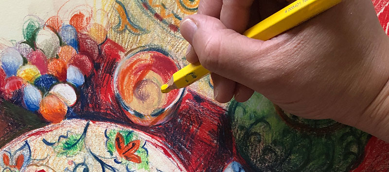
When creating color artworks, take great initiative to aggressively mix and layer your colors. Some art media require mixing, while others require colors to be layered on top of each other.
For example, with painting media, you’ll need to mix your colors with a palette knife while in a drawing using soft pastels or crayons, you’ll create different color mixtures by layering the colors on top of each other.
Mixed media is great for color
A lot of color drawing media can take time to figure out and get a full understanding of. One option to make the process a little bit easier to control, is to use several different color art media together.
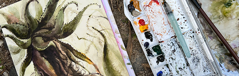
For example, I always had trouble painting with watercolors for the longest time, using only watercolor by itself always felt very intimidating.
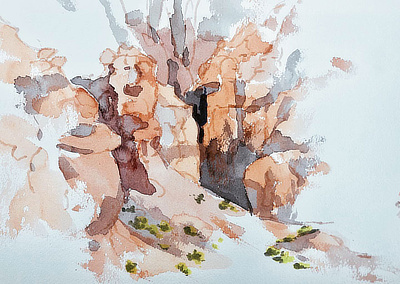
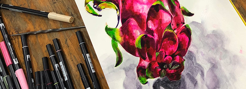
My solution to this problem was to go back and forth between alcohol-based brush pens and watercolor in the same painting. See this technique demonstrated in our Watercolor Painting in Utah tutorial.
Sometimes I would start the piece with the brush pen markers, and then add passages with watercolor.
Other times, I really enjoyed the slow and spontaneity of the watercolor as a starting point, and then I would go in with a brush pen markers to add details, increase the contrast, and make the form a lot more three-dimensional.

Step 1
Outline the composition with alcohol based markers. (there’s a little blob of watercolor on the far left)
Step 2
Cover the artwork with watercolor (over the initial marker drawing) to fill in large areas of color.
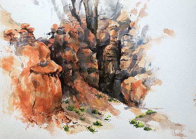
Step 3
Allow the watercolor to fully dry, then draw with the alcohol based brush pens over the watercolor to enhance the contrast, adjust the colors, and more.
In our creature tutorial, Julie Benbassat starts her drawing with a ballpoint pen which provides the structural outlines for her piece.
She fills in the majority of the color with watercolor, but then finishes off the artwork by adding small touches of colored pencil to tweak the color just a little bit.
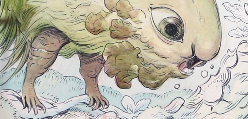
Julie’s approach to color works very well in this tutorial because filling in her drawing with watercolor is a relatively fast process.
The challenge with watercolor for a lot of artists is that it’s really difficult to control and to get a very specific shade of color.
That’s where the colored pencil becomes really important. For a lot of people colored pencil is a lot easier to control, and so it’s just a matter of layering another color over the water color to get just the right shade that you want.
The colored pencil sinks beautifully into the watercolor, making the color pencil virtually unnoticeable within the context of the watercolor painting.
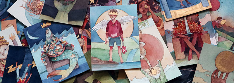
Mixed media combinations


“Straight out of the tube”
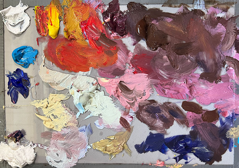
The most common problem with color media is that students do not take the time to layer and mix, causing the colors to be flat, obvious, and literal.
Frequently, when students do mix their colors, the color mixtures are predictable: adding white paint to a color to make it lighter, adding black paint to make the color darker.
Be much more adventurous than that, add alizarin crimson to your green to create a darker shade of green instead of black.
Instead of adding white paint to make a color brighter, try naples yellow instead. Naples yellow has a slight tint of yellow therefore has a touch of warmth that white paint won’t have.
Mix your own black
Try alizarin crimson with viridian to create a deep, dark purple that will very much feel like black, or try ultramarine blue with burnt umber for a cooler black. There are infinite ways to make your own black!
I explain how to mix black in greater depth in this oil painting tutorial.
Don’t use literal colors
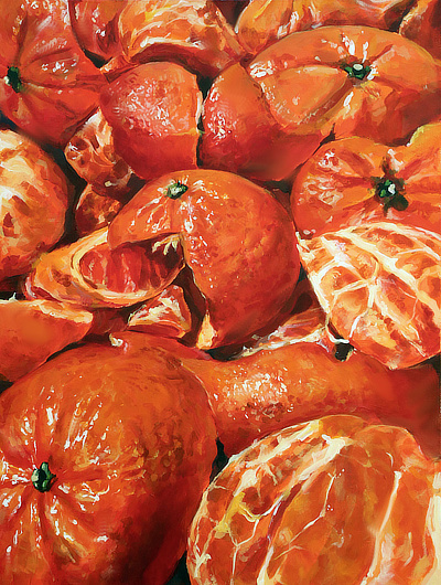
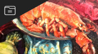
This painting on the right of oranges is beautifully painted: the painting has gorgeous details, the texture of the oranges is really well captured, the contrast is excellent, and the highlights on the oranges seem to glisten in the light.
However, in terms of color, this painting could not be more literal.
The color of the oranges is really monotonous throughout the entire painting. What if there was a slight hint of cerulean blue in one of the shadows of the oranges? What if there was a glaze of purple in another shadow?
Grass is never just green, and apples are never just red.
Train your eye to SEE color
It’s easy to look at an orange and just tell yourself, “it’s orange, I don’t see any other colors.” You won’t see other colors if you don’t look for other colors.
This circles back to drawing from direct observation, and sharpening your eye to be able to see beyond the first glance.
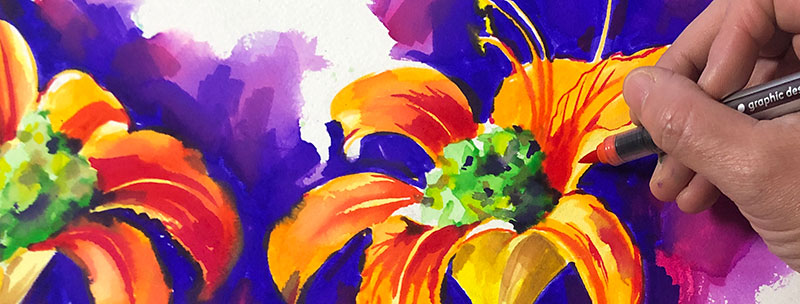
Exaggerate your colors
Frequently, students are too timid with color so they end up either working in black and white with little touches of color, causing their artworks to come across as muddy and full.
We can help you!
- You can hang out in our Discord server (it’s free) to ask questions and get advice in our #bfa-mfa channel.
- We have a range of art school services to support you, provided by our staff of professional artists.

If you approach color in terms of trying to achieve accurate colors, the colors usually are not vibrant enough to be visually engaging.
In this mixed media acrylic painting tutorial, Lauryn Welch starts out her painting by referencing a photo of a barbecue squid dish from a Japanese restaurant.
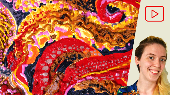
However, in her final painting she greatly exaggerated her colors by making them significantly more vibrant and saturated than they were in her original reference photo.
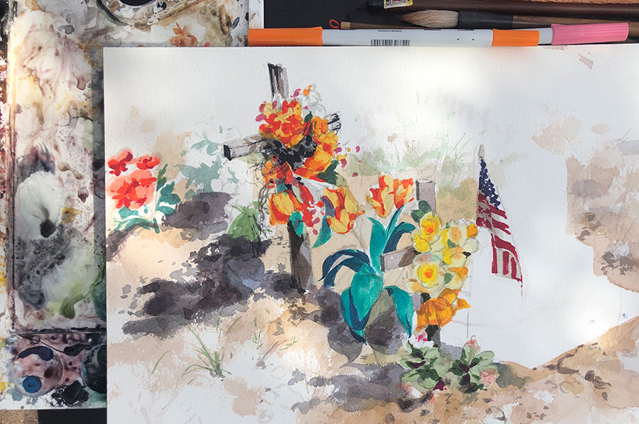
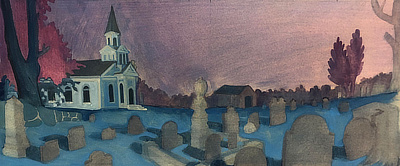
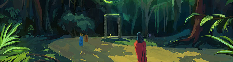
In this gouache painting tutorial, Teaching Artist Alex Rowe chooses a color scheme that is largely cool colors, using purples and maroons for trees and blue tones for the grass in a graveyard.
The result is a night scene that has a sense of quiet and darkness.

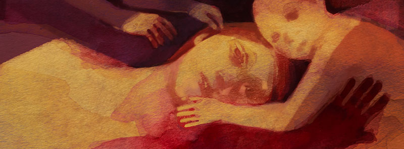
Color shows mood
Colors are not just a visual experience, they can also be seen as cultural symbols or a way to create a sense of emotion or mood.
Consider the difference between a painting with a soft blue sky vs. one where the sky is hot red tones? Depending on the color, the mood and atmosphere can be polar opposites.
Analyze color in artworks
For inspiration, look up artists who are known for their bold, wild use of color. Ask yourself as you look at their artwork, what is their approach to color? Is there a specific palette that their artwork generally uses?
Artists who focus on color
- Odilon Redon
- Dana Schutz
- Edward Hopper
- Edgar Alwin Payne
- Alex Kiesling
- Oskar Kokoshka
- Emil Nolde
- Nathan Fowkes
- Hope Gangloff
- Jennifer Packer
What mood and atmosphere does the artist achieve with their color schemes? How does the color contribute to the narrative or idea being conveyed in the artwork?
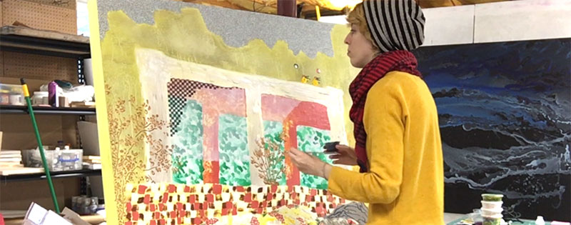
Experiment with underpaintings
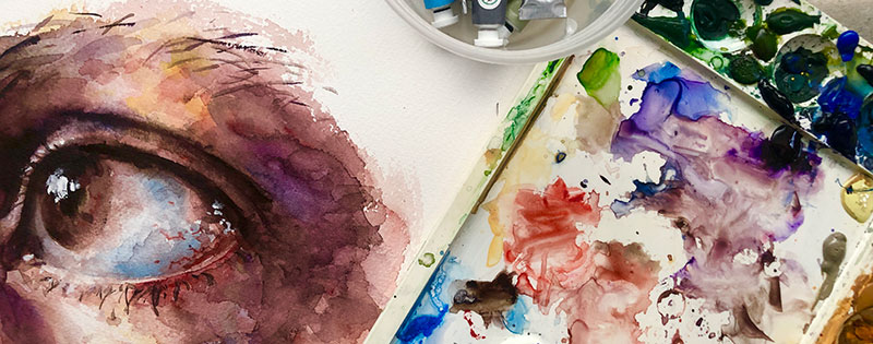
Teaching Artist Alex Rowe demonstrates an unusual approach to doing the underpainting in our acrylic eye painting tutorial.
Instead of painting the skin and eye the way they actually are, he paints the objects using their complementary color.
In Alex’s underpainting, the skin starts out as blue, and peach colors (orange is the complementary color of blue) are painting on top.
Color mixing takes time
Using color well means needing to make your own color mixtures, it’s generally very obvious when an acrylic painting has been made entirely with colors that are “straight out of the tube.”
Take the extra time and initiative and mix your colors on your palette when painting, create a subtle range or differences of one color within one acrylic painting, it will be well worth your time!
Don’t limit yourself to painting
Many students assume that if they want to incorporate color into their portfolio, the only option is acrylic painting and oil painting.
However, painting supplies are costly, and without proper training in painting techniques, both media can be incredibly difficult and frustrating to learn on your own.
Oil painting especially should not be done without proper training and guidance. There are many safety concerns associated with certain supplies in oil painting, and if you are not informed of what those are, oil painting can actually be hazardous to your health.
Drawing in Color
Instead, consider doing drawings using color drawing media such as soft pastel, oil pastels, oil bars, markers, collage, or crayons. Printmaking is a terrific way to explore colors as well!
In this Drawing in China tutorial, I draw with brush pens and then use a water brush to create a result that is really similar to watercolor.
This is a good solution because you can really control your color choices before you add water to the mix.
Each of these drawing media can be picked up without any professional training, and can yield really terrific results.